The US firm launches its new device, M2, in the Indian phone market; the device is good at the price.
by Manik Kakra | @Manik_K on Twitter
InFocus, the US-based firm has entered the Indian phone market with the new M2. The company gets its device manufactured from Foxconn and aims at providing a good smartphone at an even lower price point than what’s been available. At Rs 4,999, the price and specifications are tempting, but does it actually deliver?
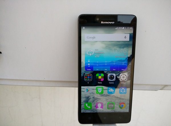
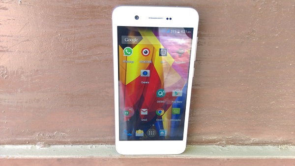
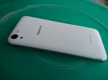
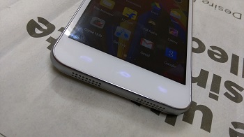
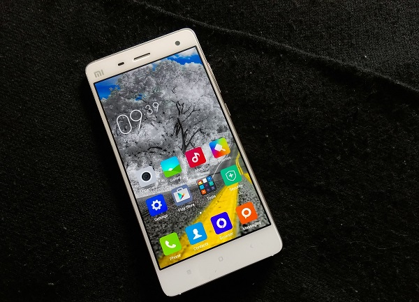
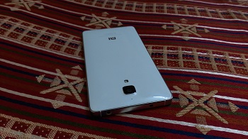
The looks. InFocus’ M2 follows a plain and run-of-the-mill design. The phone has glass all over the front and its rear cover, and which also covers the sides. As soon as you hold the device, you will notice its thick bezel and curve around the back, making it comfortable to hold. On the front, below the 4.2-inch TFT screen are the three touch keys – Menu, Options, Home and Back button – neither of these keys lit up when tapped. While on the top of the screen you have the 8 MP front-facing camera with flash, speaker grill, notification LED and sensors. The back has the 8 MP camera and flash near the top-middle, and loudspeaker placed near the bottom.
 On the sides, the volume rocker is placed on the left, and the Power/Lock key on right; these keys feel quite sharp and don’t give a tactile feedback when pressed. The microUSB port and primary mic at the bottom and 3.5mm headset jack and secondary mic are at the top. Removing the back cover gives you access to the two micro SIM card slots and microSD card slot, next to the immovable battery. The phone is not large by today’s standards and is not difficult to carry around. While I won’t call it ‘premium’, it definitely doesn’t appear as a cheap knock-off.
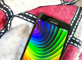
Display. The M2 boasts a 4.2-inch (1280 x 768) LCD, same resolution as on the Nexus 4. The display is to be its biggest selling point. It shows text and images well and isn’t bad for watching HD videos either. Text appears good enough, but struggles a little under direct sunlight. From what other screens I have used from phones under 7,000 bucks, this one seems to be right up there among the brightest and best in terms of colour reproduction. You even get three colour temperature options for the screen, something we have seen on Samsung smartphones for a while.
Audio. Talking about the phone’s audio performance, it didn’t leave as good an impression as the screen quality did. The loudspeaker on the back distorts quite a lot and struggles when used for a video or game. You may feel you’re missing out on sound even after using one hand for coupling the speakers. The bundled headset is okay and better for watching videos. Don’t expect a very good output. InFocus will hopefully give audio more attention next time and put better sound drivers in place. The M2’s call quality and network reception didn’t show any issues. WiFi, Bluetooth, USB OTG function just fine and I didn’t notice any bug against any of them.
Battery. Powered by a 2,010 mAh battery unit, the phone has a decent standby time, but struggles under heavy usage. More often than not, when used for Email, Twitter, a bit of music and calls, you would have to charge it again under 17 hours, keeping one SIM card inserted (even less on 3G) and the brightness level at 30 per cent.
Camera. Here are a few sample images.
The phone’s camera actually takes good shots when in bright light. It does a good job at colour contrast, though when used in low-light, no surprise it struggles and is clearly not meant for clicking 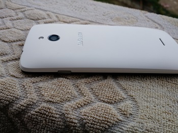 subjects in motion. It can shoot full HD videos at 30FPS. The front-facing camera is good enough for your selfie needs with its selfie smile detection and detailed shots. The camera app is simple and smooth to use. Only the usual settings are available.
Software and performance. The device runs on Android 4.4.2 with the company’s own InLife UI on top. Under the hood, there is MediaTek’s MTK6582 (1.3 GHz quad-core processor, Mali 400 GPU) and 1 GB of RAM. The user gets about 5 GB of available space, which you can expand using a microSD card.
The phone handles basic tasks like scrolling or swiping through Home screens and having a single Chrome tab open in background without breaking a sweat. But when you close and open a few apps, open multiple tabs and try scrolling through the OS, the phone clearly struggles and stutters. The notification and toggle buttons can be accessed from the same screen by swiping down. All the icons, Settings and pre-loaded apps are themed around white, pink and blue colours. These look just okay, but certainly not ugly like a few other low-priced Chinese phones do. The pre-loaded apps also work well and should cater to most users using their first Android smartphone. With your Home screens having all the icons and widgets, there’s no separate app launcher.
The lock screen allows you to keep four shortcut icons (similar to HTC phones) and even widgets in place to open them directly from the Lock screen. There’s also a launcher option with large tiles and bigger font size called EZ Launcher. It would be correct to say the phone doesn’t perform very smoothly but just satisfactorily. There’s also InFocus services Account in place, though we couldn’t find any utility for it.
InFocus seems to have done most things well with the M2, considering its price point. It has a good screen, camera and design, but its audio is clearly its shortcoming. It is still to be seen whether the company has provided any service support so far given that even the official website doesn’t mention any service centres or support number. If InFocus can get this after-sale part correct from here on, the M2 can give them a great start and make its presence felt in the online retail space.